Mastering the art of t-shirt logo placement is crucial for enhancing brand visibility and aesthetic appeal. This comprehensive guide provides expert tips, practical advice, and step-by-step instructions to help designers, businesses, and creators achieve professional results. Whether you’re working with chest logos, back designs, or sleeve placements, this guide covers it all, ensuring your designs stand out and leave a lasting impression.
1.1 Importance of Logo Placement in T-Shirt Design
Proper logo placement is vital for maximizing brand visibility and ensuring a balanced, professional appearance. Strategic positioning enhances aesthetic appeal, drawing attention to the design without overwhelming the viewer. It also prevents logos from being stretched or lost in seams, maintaining their integrity. Effective placement considers size, proportion, and contrast, ensuring the logo stands out while complementing the garment’s overall look.
1.2 Brief Overview of Common Logo Placement Locations
Common logo placements include the chest, back, sleeves, hem, and pocket area. The center chest is ideal for visibility and balance, while the back offers space for larger designs. Sleeves are perfect for smaller logos, and the hem or pocket area provides subtle branding opportunities. Each location serves different design goals, such as promoting a brand, showcasing event themes, or adding artistic flair. This guide explores these placements in detail to help you choose the best spot for your design.

Understanding the Basics of Logo Placement
Understanding the basics of logo placement is essential for creating visually appealing designs. It involves considering design size, proportions, and alignment to achieve a professional finish.
2.1 Common T-Shirt Logo Placement Locations
The most common t-shirt logo placement locations include the chest, back, sleeves, and hem. Chest placement is ideal for small to medium-sized logos, typically positioned 3-4 inches below the neckline. Back designs are often larger and centered, while sleeves accommodate smaller logos, usually 2-3 inches above the cuff. Hem placement is subtle, often used for brand tags or minimal branding, ensuring a balanced and polished look.
2.2 Factors to Consider When Choosing Logo Placement
When selecting logo placement, consider design size, garment type, and balance. Ensure the logo proportions match the shirt size and avoid overcrowding. Chest logos should be centered, 3-4 inches below the neckline, while back designs are often larger and centered. Sleeve logos should be small and aligned vertically. Consider fabric type, color contrast, and printing techniques to ensure visibility. Balance is key to a professional, polished look that enhances brand visibility and appeal.
Popular T-Shirt Logo Placement Options
Explore the most popular t-shirt logo placements for maximum visual impact. Chest, back, sleeve, and hem placements offer versatility and ensure your design stands out.
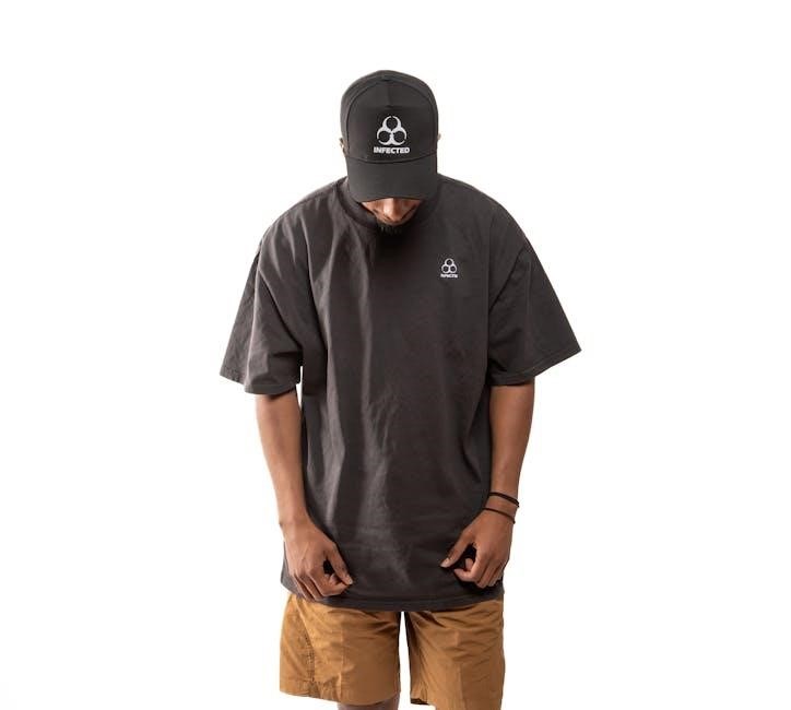
3.1 Chest Placement
Chest placement is a popular choice for logos, offering high visibility and a professional look. Position the logo 4-6 inches below the collar seam, centered for balance. Keep the width between 8-10 inches to avoid stretching across seams. This placement works well for bold graphics or event logos, ensuring your design stands out and maintains a polished appearance on any t-shirt style.
3.2 Back Placement
Back placement is ideal for larger designs or bold statements. Position the logo 5 inches below the neckline, centered for maximum visibility. Full-back designs can stretch across the entire back, while upper-back placements offer a more subtle look. This placement is perfect for event graphics, slogans, or intricate artwork, ensuring your message is seen and makes a lasting impression on custom t-shirts.
3.3 Sleeve Placement
Sleeve placement offers a unique way to add style and subtlety to t-shirt designs. Position logos or graphics 1-2 inches below the shoulder seam, centered horizontally and vertically. This placement works well for smaller logos or complementary designs, ensuring balance without overwhelming the shirt. It’s ideal for brand accents or secondary imagery, adding a polished touch while maintaining visual harmony with the overall design.
3.4 Hem Placement
Hem placement is a modern and trendy option for t-shirt designs. Positioning logos or graphics near the hemline adds a subtle yet stylish touch. Ideal for smaller designs, this placement avoids overwhelming the shirt while maintaining a minimalist aesthetic. It’s perfect for brand tags or small artwork, offering a discreet yet impactful way to enhance your t-shirt’s design without compromising its overall look.
3.5 Pocket Area Placement
Pocket area placement offers a subtle and practical way to incorporate logos or designs. Ideal for small-scale graphics, this placement complements the shirt’s functionality while adding a touch of style. It works well for secondary logos or complementary designs, avoiding clutter on the main body. Perfect for casual or professional looks, pocket placement ensures your design is noticeable without being overwhelming, making it a versatile choice for various t-shirt styles.

Design Considerations for Logo Placement
Proper sizing, proportions, and color contrast are essential for effective logo placement. Ensure high-resolution files and appropriate file formats for sharp, professional prints that stand out on fabric.
4.1 Design Size and Proportions
Proper sizing and proportions are critical for a balanced look. A chest logo should be 8-10 inches wide, while sleeve designs are smaller, around 2-4 inches. Ensure the design fits naturally without stretching or distorting. Square or horizontal logos work best for chest placement, while vertical designs suit sleeves. Always align the logo symmetrically and avoid overcrowding to maintain a professional, polished appearance that complements the garment.
4.2 File Formats and Resolution for Printing
Using the right file formats and resolution ensures crisp, professional prints. Vector formats like EPS or SVG are ideal for scaling without quality loss, while raster formats like PNG offer transparency. High DPI (300 dots per inch) is essential for clear details. Avoid low-resolution images to prevent pixelation. Ensure designs are in CMYK color mode for accurate printing. Proper file preparation guarantees vibrant, sharp logos that enhance your brand’s visual identity and appeal.
4.3 Color Matching and Contrast
Color matching and contrast are vital for logo visibility and visual appeal. Choose colors that complement the shirt’s fabric and ensure high contrast for readability. Use Pantone color guides or digital tools for accurate shade representation. High-contrast combinations enhance legibility, while subtle tones create a sophisticated look. Proper color selection ensures your logo stands out, aligning with your brand’s identity while resonating with your target audience for maximum impact;

Tools and Techniques for Accurate Logo Placement
Utilize tools like t-shirt rulers, heat press alignment guides, and design software for precise logo placement. These tools help ensure accuracy, symmetry, and professional results every time.
5.1 Using a T-Shirt Ruler Guide
A t-shirt ruler guide is an essential tool for achieving precise logo placement. Made from materials like cardstock or plastic, it helps center designs accurately. Use it to align logos symmetrically and avoid misplacement. Place the ruler on the shirt, ensuring the design stays within the marked boundaries. This tool is perfect for DIY projects and professional printing, ensuring your logos look sharp and well-positioned every time.
5.2 Heat Press Alignment Tools
Heat press alignment tools are indispensable for precise logo placement during printing. Use a ruler guide to ensure designs are centered and symmetrical. These tools help align graphics accurately, preventing misplacement. Ideal for both DIY and professional setups, they ensure logos appear sharp and well-positioned. A must-have for achieving consistent, high-quality results in custom t-shirt printing.
5.3 Software for Design Placement Simulation
Design placement software allows creators to visualize logos and graphics on virtual t-shirt models before printing. Tools like Adobe Photoshop or online editors enable precise positioning, scaling, and alignment. These programs offer real-time previews, ensuring designs are proportionate and visually appealing. They also support virtual try-ons for different garment types, helping designers make informed decisions. Such software is essential for achieving professional results and minimizing errors in the printing process.
Tips for Different Garment Types
Explore tailored advice for various garments: hoodies, polos, and long sleeves; Each style requires unique placement strategies to ensure designs look their best and are highly visible.
6.1 Hoodies and Sweatshirts
When designing for hoodies and sweatshirts, consider the thicker fabric and relaxed fit. Common placements include the chest, back, and sleeves. For hoodies, the front pocket area or upper back are popular. Ensure designs are bold and large enough to stand out on heavier materials. Avoid overcrowding, as this can make the garment look cluttered. Balance is key to maintaining a polished, professional appearance.
6.2 Polo Shirts
Polo shirts offer a classic canvas for logo placement. The left chest is a standard location, with sizes ranging from 3.5″ to 4.5″ wide, depending on the garment size; For a polished look, avoid overcrowding and ensure the logo is centered and proportional. Additional designs can be placed on the sleeve or near the hem for added versatility. Balance is key to maintaining the sophistication of the polo shirt design.
6.3 Long Sleeve Shirts
Long sleeve shirts offer versatile logo placement options. The forearm area, 4-6 inches above the cuff, is ideal for small logos or slogans. The upper back and chest areas are also popular, with designs typically placed 3-5 inches below the neckline. Ensure logos are proportional to the sleeve length and avoid overcrowding. Balance is key to maintaining a polished, professional appearance on long sleeve designs.

Creative and Unique Logo Placement Ideas

Explore innovative logo placement strategies to make your designs stand out. From asymmetrical layouts to wraparound prints, discover how unique positioning can elevate your brand’s visual appeal.
7.1 Asymmetrical Designs
Asymmetrical designs offer a modern, eye-catching alternative to traditional logo placements. By positioning logos off-center or at unique angles, you can create a dynamic visual impact. This approach works well for artistic designs, allowing for creative freedom while maintaining balance. Consider placing logos slightly to one side of the chest or along the upper back for a stylish, contemporary look that draws attention without overwhelming the garment.
7.2 Wraparound Prints
Wraparound prints are a bold, creative choice that extends designs across the shirt, creating a seamless, 360-degree effect. Ideal for vibrant, detailed artwork, these prints ensure maximum visibility from all angles. To achieve this look, use alignment tools and digital simulations to ensure proper placement and symmetry. Wraparound designs are perfect for making a statement, offering a unique way to showcase intricate patterns or brand messaging without compromising on style or visual impact.
7.3 Minimalist Placement
Minimalist placement emphasizes simplicity and balance, often featuring small logos or subtle designs. Ideal for understated branding, this style places logos discreetly on areas like the chest, sleeve, or hem. By avoiding clutter, minimalist designs ensure the logo remains the focal point. Proper alignment tools and sizing charts are essential to maintain proportion and visual harmony, creating a clean, professional look that appeals to modern aesthetics and sophisticated audiences alike.
Common Mistakes to Avoid in Logo Placement
Overcrowding designs, ignoring proportions, and poor color contrast are common mistakes that can detract from a logo’s impact. Ensure balance and clarity for professional results.
8.1 Overcrowding the Design
Overcrowding a t-shirt with too many logos or designs can make the garment look cluttered and unprofessional. This mistake often occurs when trying to fit multiple elements into limited space. To avoid this, ensure your design is balanced and leaves enough white space. A cluttered design can make the logo less visible and distract from its intended impact. Keeping it simple and focused ensures your message stands out clearly and attractively.
8;2 Ignoring Proportions
Ignoring proportions is a common mistake that can ruin the balance of your t-shirt design. A logo that is too large may overwhelm the garment, while one that is too small might be overlooked. Properly sizing your logo ensures it complements the shirt’s dimensions, making the design visually appealing. Always consider the shirt’s measurements and the logo’s size to maintain harmony and achieve a professional look.
8.3 Poor Color Contrast
Poor color contrast can make your logo less visible and less appealing. Ensure the logo colors stand out against the shirt’s background. Dark logos on dark shirts or light logos on light shirts can blend in, reducing visibility. Test the design on actual fabric and use online tools to check contrast. Proper color matching enhances readability and ensures your brand stands out effectively.
Measuring Techniques for Precise Placement
Accurate measurements are key to professional logo placement. Use rulers, templates, or digital tools to ensure precise positioning, avoiding errors and enhancing the final design’s appeal.
9.1 Using a Measuring Tape
A measuring tape is essential for precise logo placement. Measure 4-6 inches below the collar for chest logos, ensuring symmetry. For sleeves, measure 1-2 inches above the hem. Mark the center point to avoid misalignment. This method ensures accurate positioning and prevents design stretching. Always double-check measurements to maintain balance and professional results.
9.2 Creating a Placement Template
A placement template is a reusable tool for consistent logo positioning. Use cardstock to create outlines for common placements like chest, back, and sleeves. Mark standard measurements, such as 4-6 inches below the neckline for chest logos. Ensure symmetry by aligning the template’s center mark with the garment’s midpoint. This method prevents errors and saves time, especially for bulk orders. It’s a cost-effective solution for precise and professional results every time.
9.3 Digital Measurement Tools
Digital tools streamline logo placement by offering precise measurements and simulations. Software like Placeit or Adobe Illustrator allows you to visualize designs on virtual models. These tools provide real-time adjustments, ensuring proper alignment and proportion; They also offer size charts and templates for consistency across different garment types. Digital tools enhance creativity and professionalism, making it easier to achieve flawless logo placement every time while reducing errors and saving time.

T-Shirt Logo Placement Size Chart
A size chart ensures logos fit perfectly on t-shirts. Standard sizes range from 3-4 inches for chest logos to 8-10 inches for full-front designs, adjusting for garment type and desired impact.
10.1 Standard Logo Sizes for Different Placements
Standard logo sizes vary by placement. Chest logos are typically 3.5-4.3 inches wide, centered 4-6 inches below the neckline. Sleeve logos are 2-3 inches wide, positioned 1-2 inches above the hem. Full-back designs range from 10-14 inches wide, centered 5 inches below the neckline. Hem placements are 6-8 inches wide, aligned with the shirt’s bottom seam. Sizes adjust based on garment type and desired visual impact.
10.2 Adjusting Sizes for Various Garment Types
Logo sizes vary across garment types. Hoodies and sweatshirts often accommodate larger designs, with logos up to 5-6 inches wide. Polo shirts typically use smaller logos, 3-4 inches wide, positioned 4-5 inches below the collar. Long sleeve shirts may feature sleeve logos of 2-3 inches wide, centered vertically. Adjustments ensure proportions remain balanced, maintaining visual appeal across different styles and fits.
Step-by-Step Guide to Logo Placement
Prepare your design, position it accurately using measurement tools, and secure it for printing. Ensure balanced placement, precise alignment, and proper proportions for a professional finish.
11.1 Preparing the Design
Begin by ensuring your logo or artwork is high-resolution and properly formatted. Use design software to adjust colors, contrast, and size. Check for symmetry and balance. Ensure the design fits the intended placement area without distortion. Proofread text and test the design on a digital mockup. Finally, save the file in the appropriate format for printing, such as PNG or vector graphics, to avoid pixelation and ensure crisp details. Proper preparation guarantees a polished final product.
11.2 Positioning the Design on the T-Shirt
Positioning your design accurately is key to a professional finish. Use a ruler or alignment tool to center the design on the chest or back. For chest placement, align the logo 4-6 inches below the collar seam. Ensure the design is balanced and avoids seams. Double-check measurements and adjust as needed. Use heat-resistant tape to secure the design temporarily. Proper alignment ensures the logo looks sharp and well-integrated with the garment. Precision is essential for a polished result.
11.3 Securing the Design for Printing
Once positioned, secure the design firmly to prevent shifting during printing. Use heat-resistant tape or a pressing pillow to hold it in place. Ensure the fabric is smooth and wrinkle-free. For heat press methods, place parchment paper over the design to protect it. Pre-heat the press to the recommended temperature and apply even pressure. Proper securing ensures crisp, clear prints and prevents ink or vinyl misalignment. Attention to detail here guarantees professional-quality results.
Case Studies of Successful Logo Placements
Explore real-world examples of brands, events, and artistic designs that nailed logo placement. Learn from their strategies to create visually impactful and memorable t-shirt designs.
12.1 Brand Logos on T-Shirts
Successful brand logos on t-shirts often feature center chest placement, ensuring visibility and professionalism. For example, a 3-4 inch wide logo positioned 4-6 inches below the neckline is ideal. This size maintains balance without overwhelming the design. Other placements, like sleeve logos (1-2 inches above the cuff) or back logos (full or upper back), offer versatility. These strategies enhance brand recognition and create a polished, cohesive look for promotional or retail purposes.
12.2 Event and Promotional Designs
For event and promotional t-shirts, center chest placement (8-10 inches wide) ensures maximum visibility, making it ideal for slogans or logos. Back designs, either full or upper back, are also effective for larger graphics or messages. Sleeve logos (1-2 inches above the cuff) add a subtle yet professional touch. These placements enhance brand visibility and create memorable impressions, perfect for marketing campaigns, events, or promotions. Proper sizing and alignment are key to achieving a polished look.
12.3 Artistic and Creative Designs
Artistic and creative designs thrive when paired with unique logo placements. Asymmetrical designs on the chest or sleeves add visual interest, while wraparound prints create dynamic, eye-catching effects. Minimalist placements, like small logos near the hem or on the upper back, offer subtle yet stylish branding. These placements allow artistic expression to shine, balancing creativity with functionality to ensure the design stands out without overwhelming the viewer.
Effective logo placement enhances both aesthetics and branding. Balance, proportion, and contrast are key. Use tools and tips for professional results, ensuring your designs stand out and impress.
13.1 Recap of Key Logo Placement Principles
Effective t-shirt logo placement balances aesthetics and functionality. Ensure designs are proportional, visible, and aligned with the garment’s natural lines. Use tools like rulers and heat presses for precision. Avoid overcrowding and poor contrast. Consider garment type, size, and printing method. Test designs on samples to ensure professional results. By following these principles, you’ll create visually appealing and impactful custom t-shirts that stand out.
13.2 Final Tips for Achieving Professional Results
Invest in tools like alignment guides and heat presses for precision. Use high-resolution files and ensure designs are suitable for the fabric type. Test designs on sample shirts before bulk production. Maintain balance and symmetry for a polished look. Avoid overcomplicating layouts and ensure proper spacing. Follow these tips to create professional, visually appealing t-shirts that reflect your brand’s excellence and leave a lasting impression.